If you’ve taken even a cursory look at the watch industry over the past handful of years, you’d know that the Rolex Cosmograph Daytona is just about the hottest watch in the game. From vintage “Paul Newman” examples constantly setting records at esteemed auction houses to the comically long waitlists for those trying to get one of the ceramic-bezeled modern versions, Rolex’s iconic motorsports chronograph is the watch that everyone wants — and that almost no one can get.
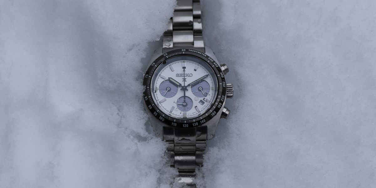
So, with Daytonas being both very expensive and difficult to obtain, even for those with the means to do so, many watch enthusiasts look to alternatives from other brands. And if you’re looking to stick to a budget under $1,000, there’s probably no more popular alternative than the Seiko Prospex Speedtimer Solar Chronograph — specifically, the reference SSC813. With its black and white panda dial, classic sports watch design and prominent black tachymeter bezel, the “Seitona” bears a strong resemblance the the elusive Rolex at a tiny fraction of the price.
But is this Seiko chronograph more than just a pretty face? To find out, I got hands-on with an SSC813 and spent the past few weeks wearing it. Here are my thoughts.
Seiko Prospex Speedtimer Solar Chronograph: What We Think
If you’re looking for an affordable, well-made everyday watch that looks quite a bit like a Rolex Daytona, then you will likely enjoy the Seiko Prospex Speedtimer Solar Chronograph. The watch looks awesome, feels premium and is just the right size to fit a number of wrists very comfortably. The solar-powered quartz movement is the height of convenience — it’s always powered up and the time is pretty much always right — and Seiko has incorporated the technology in a fun and clever way.
The movement, though, could be a lot more useful. The chronograph only tracks up to an hour then resets, and the date is tough to read. I also question a couple of minor design choices on the mostly attractive watch, but on the whole, this is one of the best chronographs out there for under $1,000.
It’s a great-looking watch
One of the main draws of the Solar Speedtimer — perhaps the main draw — is its looks. Yes, it looks a lot like a Daytona, or more accurately, it looks like a Zenith El Primero Chronomaster Sport due to the dial being a true panda rather than going with the outlined subdials of modern Rolex chronographs. But even if it didn’t closely resemble the appearance of those far more expensive watches, it would still look great.
The black and white color scheme is gorgeous, the dial is perfectly symmetrical (well, except for that date window … I’ll get to that later) and keeps text to a minimum, the case shape is simple, classic and has a nice flow to it, that big and bold bezel is striking, the retro pump-style pushers look good and the applied indices are polished in such a way that they have just the right amount of sparkle. It’s a damn handsome watch at any price and a real crowd-pleaser. The Rolex vibes are just a bonus.
The sizing is spot-on
Speaking of crowd-pleasing, the sizing of this watch couldn’t be much better. The case measures 39mm across, the size seemingly everyone wants on their wrist these days, and just 45.5mm lug-to-lug, making it easy to wear on my 6.25-inch wrist. Unlike some of Seiko’s mechanical watches, the quartz movement keeps it relatively svelte at 13.3mm thick. That size obviously isn’t crazy thin, even for a quartz chronograph, but the way the case, bezel and crystal are structured makes it both appear and feel thinner than it is. (For reference, the new Seiko automatic panda Speedtimer is 14.6mm thick and 42mm across.)
The case design also has a lovely curve that allows it to really hug the wrist, further mitigating the thickness and letting the watch sit nice and low. I’ve never had any trouble with shirt sleeves failing to slide over the top of the watch, thanks both to the low stance and the sloping convex shape of the bezel. By the way, the bezel looks ceramic, even in person, but it is painted stainless steel. The watch also has a decent amount of heft befitting a sports watch — if I didn’t know any better, I’d assume it was mechanical based on its weight alone. This suggests that Seiko didn’t skimp on materials or build quality, which is nice to see (and feel).
I’m not a fan of the movement
Let me just say that I’m not being some mechanical watch snob here. Quartz watches are fine, and sometimes their grab-and-go convenience is just what the doctor ordered. And I have no problem with the actual time-telling capabilities or practicality of the solar quartz movement inside the watch. The time has been bang-on since I set it, and the power reserve has always been completely full — which it will be for years as long as it sees some form of light.
The way Seiko has incorporated the charging panels for the solar movement is also quite clever, and I appreciate that. The subdials themselves appear black most of the time, but in direct light, they turn more of an opalescent purple. It looks like anti-reflective coating on the sapphire crystal (which it does feature), but the color actually comes from the subdials themselves, as they double as solar panels.
So what don’t I like about this movement? Two things, really. Number one is the date window. Many people will gripe about its placement at 4:30, but that doesn’t really bother me. What I dislike is how far sunken down it is compared to the dial. The date wheel feels like it’s several millimeters below the window, which makes the date difficult to read since it’s far away and blanketed in shadow. And reading it at an angle is basically impossible. I’d rather see the date omitted than be basically unusable.
As for the chronograph, I found it to only be useful when timing something shorter than one hour. That’s because out of the three registers on the dial, only the one at six o’clock is for the chronograph. The subdial at three displays 24-hour time and is tied to the main timekeeping — a useless feature — and the subdial at nine is the running seconds.
At six o’clock is the smallest yet most used subdial, the chronograph minute counter. It’s hard to read because it’s cramming 60 minutes into a tiny subdial, and worse, there’s also no way to know when your hour is up. I’ll set the chronograph wanting to track something that’s an hour-long only to glance down later at a stopped chronograph showing the full 60 minutes, with no idea how long ago it ended its run. A movement that replaces the 24-hour counter with a chronograph hour counter would be ideal, and it’s not like Seiko is incapable of making such a movement.
The bracelet is better than I expected
Everyone loves to drag Seiko for its bracelets, and yeah, for a long time, they weren’t great. But modern Seiko bracelets are actually pretty solid, particularly those from the Prospex line. The Seitona has a standard oyster-style bracelet that is nothing to write home about, but it fits the watch well and is executed nicely. The links and end links are all solid, the tolerances are tight, the milled-out clasp is rugged and the double push-button mechanism feels very secure. I’ve owned a couple of quartz Grand Seikos with standard oyster bracelets, and outside of the finishing, their bracelets were not terribly different from this.
I would swap the crown and handset
Now, onto a couple of minor nitpicks. First, the crown. There’s nothing technically wrong with the crown. I think it’s well-proportioned, it’s easy to grip and it’s simple to operate — it’s a quartz watch, so you’re not going to be using it much anyway. My problem is that it’s unsigned. How Seiko is selling watches with unsigned crowns for $700 in 2024 is beyond me, considering how every microbrand with $5 in the bank seems able to engrave a logo into their watches’ crowns.
Next, the handset. It’s too thin and small, making it harder to read. Seiko went with a larger, bolder handset on the 42mm version of the Solar Speedtimer, and it looks better. They should make the same update in this original smaller iteration. Then there’s the chronograph seconds hand. It has a tiny lumed arrow near its tip that is so small I mistook it for a crumb on the watch’s crystal more than once. Like … a lot more than once. A larger arrow would solve this mildly annoying problem.
Seiko Prospex Speedtimer Solar Chronograph: Alternatives
If what you’re looking for is a chronograph with a similar vibe to the Rolex Daytona but costs a lot less money, the Prospex Speedtimer is going to be your best bet at this price point. If you spend less money, the Timex Q Timex Chronograph in 40mm is a handsome quartz-powered chronograph that only costs about 200 bucks. If you can go up in price, then you’ll have a lot more options. For about a thousand dollars more, you can get the beautiful Baltic Tricompax Panda, which comes in at 39.5mm and is powered by a manual-wind Sellita SW510-M movement.
Add another two grand to the budget (we’re up around $3,700 now) and the Longines Conquest Chronograph is your best bet. Size may be an issue at 42mm, and we’re talking serious money here, but you’ll be hard-pressed to find any chronograph — Daytona-esque or not — that gives you more for the money.


